Internal link analysis is a common part of auditing a site for SEO. While our goals may vary, we’re typically trying to understand a URL’s discoverability within a crawl and the distribution of “link value” through the site (and how we may best optimize that distribution). This means exploring the site’s structure, a URL’s depth, a URL’s internal inlink count, and other various metrics like Internal PageRank or Link Score.
These are great places to start, but we can use graph theory to better understand a site’s internal link graph, especially for medium-to-large sites with complex graphs. If you are used to using inlink exports from tools like Screaming Frog or Botify, this can be a helpful tool for exploring your data. Graph theory can give us a more robust and nuanced vocabulary when auditing a site’s internal link graph. For those not familiar with graph theory, we’ll be exploring it in-depth in this post.
This post aims to introduce some more advanced link graph analysis techniques using Python’s NetworkX package. I plan to publish a series of these posts, increasing in complexity as we go along. I’ll start with the fundamentals, and then we’ll move into some more real-world examples in future posts.
Table of Contents
- Introduction to Graph Theory
- Our Dataset
- Getting Started with NetworkX
- Adding Attributes to Our Nodes
- Visualizing our Graph
- Measures to Describe Our Graph
- How to Transverse a Graph
- Measure to Score Pages in Our Graph
- Understanding Connectivity
- Comparing Link Graph Scenarios
Graph Theory
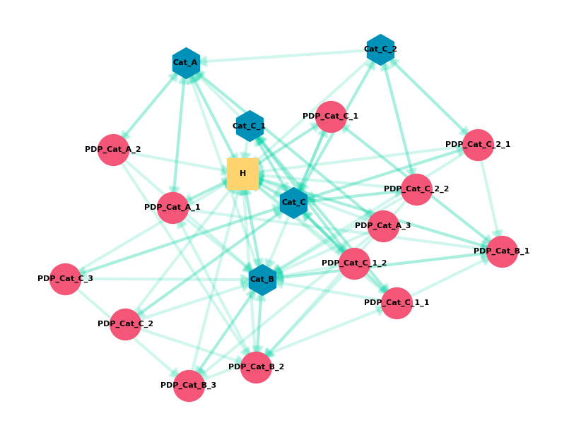
Graph Theory is the study of graph structures with pairwise relationships between objects. A graph is made up of Nodes and connected by Edges. Nodes can be almost anything, but today we’ll be looking at how URLs (nodes) are connected via hyperlinks (edges) within a single website. An SEO Internal Link Graph is a Directed Graph with the edge pointing in a one-way direction from node A to Node B. A typical visualization looks like this.
We’re going to get into some more advanced aspects of graph theory today. I highly recommend this video by William Fiset. It’s an excellent overview of major concepts.
Our Dataset
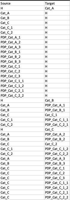
In this first post, I’ll be using a dummy dataset for a small site. The data will be in a format similar to an inlinks export from SEO tools like Screaming Frog or Botify. It’s a CSV edge list with unique Source and Target pairs.
I’ll use the same site with three different internal link scenarios (more on this later). All three scenarios have the same set of nodes (or pages). Here are the naming conventions I’m using for page names.
Page Naming Conventions
- H – Home
- Cat_A – Category A
- Cat_C_1 – Subcategory of C
- PDP_Cat_A_1 – PDP that is a child of Category A
- PDP_Cat_C_1_1 – PDP that is child of first Subcategory of C
Edge List
Our Scenario 1 edge list data looks like this:
Scenarios in Data Set
All three sets are the same site, with the same set of nodes. They differ in how they link to each other. Each scenario gets increasingly complex.
The goal is to demonstrate the effect of different linking features, such as breadcrumbs or related products, to see how they change the graph. We can also compare the scenarios to see how different real world website features change our link graph’s performance.
The differences in the scenarios are:
Scenario 1:
- All nodes link to Home
- Home links to Level 1 Categories
- Categories link to Subcategories (their children)
- Categories link to child Products (PDP)
Scenario 2:
- All links from Scenario 1, plus:
- Breadcrumb links to Category parents on PDP
- Breadcrumb links to Category parents on Subcategories
Scenario 3:
- All links from Scenario 2, plus:
- All Categories link to Cat_A (“Popular Category” feature)
- All PDP link to Cat_B (“Popular Category” feature)
- PDP link to 2 other PDP outside its Category (“Related Products” feature)
- Homepage links to 3 PDP (“Top Products on Homepage” feature)
A Note on Python
I’ll assume a basic familiarity with Python but will try to explain my code.
If you’re just getting started with Python, it’s a great language to learn. I suggest checking out Automate the Boring Stuff with Python (free online). It’s a nice starting place for the types of things we can use Python for in SEO.
I’ll share the raw output in the terminal or a Jupyter notebook throughout the post, which may not always be the most readable. I did this so you can see what you have to work with. In future posts, I can share scripts that can output to more usable formats (CSV, web app, notebooks, etc.)
If you’re not familiar with Python data structures, check out these guides on lists and dictionaries (or Python’s tutorial on data structures). This will help you understand the structure of the data we’re working with and how to use the exports we get from various functions in NetworkX.
Lastly, I know my way around a bit of Python, but I’m no expert. I may not do something in the most efficient way.
Introduction to NetworkX
NetworkX is a Python package that gives us many tools to analyze and visualize network graphs. We can import data types of graphs, run functions/algorithms, transverse, and plot our graph. It works with many other standard data analysis packages like Matplotlib and NumPy.
You can install these packages by putting this into terminal:pip install networkx
If you’re on Mac and have installed Python 3, use pip3.
In future parts of this series, I’ll cover packages like Matplotlib and Pandas in more detail. They’ll be helpful when we’re working with and visualizing larger graphs.
Importing Our CSV Edgelist
Here is the code we’ll use to import our data from CSV. I’ll walk through it below.
#Import the packages we need
from pathlib import Path
import matplotlib.pyplot as plt
import networkx as nx
from numpy import random as nprand

# Use a random seed to make sure we get the same visual
import random
seed = 2
nprand.seed(seed)
random.seed(seed)

# Set data directory path
data_dir = Path('.') / 'data'

# Open CSV and store graph
with open(data_dir / 'scenarios' / 's3.csv', 'rb') as f:

# Skip header
    next(f)

    # Read edgelist format
    G = nx.read_edgelist(
        f,
        delimiter=",",
        # Create using directed graph
        create_using=nx.DiGraph,
        # Use Source and Target columns to define the nodes of our edges
        data=[('Source', str), ('Target', str)])
First, I’m importing the packages I’ll be using. The main two are matplotlib.pyplot and networkx. I’ll be adding another later in the post. I’m using Path to help with my data source path, but you can hardcode the path. I’m using numpy to set a random seed.
When visualizing a graph, you can get a different visual each time you run your code. This is because the layout is based on a random number. The section of the code where I set seed=2 is just me circumventing this behavior. Each time I run the code, I’ll get the same visual (because I’m no longer using a random seed value)
After opening and reading in the data CSV, we store the graph in G. There are a few things to note here.
- NetworkX can work with several data types. My data is an “edgelist,” which means it’s a list of edges defined by two nodes. That’s why I’m using read_edgelist, but there are other formats you can use. The edgelist format allows edge attributes, but not node attributes. I’ll cover more formats in futures parts of this series.
- I’m using the “create_using=nx.DiGraph” parameter to let NetworkX know that my edges are Directed (“Di”). By default, it will read in a graph as undirected.
- My data is stored by using the name of the column (first row). If you’re using a CSV with additional data, this lets you select which columns to import as your edge pairs. When using a Directed Graph (DiGraph), node order matters. The first node will be the Source, and the second node will be the Target.
Checking our Graph
Now that we’ve imported our graph, we can interact with it in Python and run some rudimentary functions to summarize our data.
#Graph Info
print(nx.info(G))

#Check if graph is Directed - True/False
print(nx.is_directed(G))

#Count of Nodes
print(nx.number_of_nodes(G))

#Count of Edges
print(nx.number_of_edges(G))
This would give us (with a bit of formatting):
Type: DiGraph
Number of nodes: 19
Number of edges: 89
Average in degree: 4.6842
Average out degree: 4.6842Directed:True
Number of Nodes: 19
Number of Edges: 89
Next, we can print out a list of the nodes and edges in the graph.
print("Nodes:")
print(list(G.nodes))

print("Edges:")
print(list(G.edges))
Output (with edge list truncated):
Nodes:
[‘H’, ‘Cat_A’, ‘Cat_B’, ‘Cat_C’, ‘Cat_C_1’, ‘Cat_C_2’, ‘PDP_Cat_A_1’, ‘PDP_Cat_A_2’, ‘PDP_Cat_A_3’, ‘PDP_Cat_B_1’, ‘PDP_Cat_B_2’, ‘PDP_Cat_B_3’, ‘PDP_Cat_C_1’, ‘PDP_Cat_C_2’, ‘PDP_Cat_C_3’, ‘PDP_Cat_C_1_1’, ‘PDP_Cat_C_1_2’, ‘PDP_Cat_C_2_1’, ‘PDP_Cat_C_2_2’]
Edges:
[(‘H’, ‘Cat_A’), (‘H’, ‘Cat_B’), (‘H’, ‘Cat_C’), (‘H’, ‘PDP_Cat_A_1’), (‘H’, ‘PDP_Cat_B_1’), (‘H’, ‘PDP_Cat_C_1’), (‘Cat_A’, ‘H’), (‘Cat_A’, ‘PDP_Cat_A_1’), ….. ]
Now that we have confirmed that we’ve loaded in our graph, we can do a basic visualization of the graph.
Adding Attributes to Our Nodes
Before we visualize this graph, I want to categorize my nodes by page type (Home, Category, or PDP). To do this, I’m going to check the Node_ID name for different naming patterns, and then I’m going to store the node’s page type as a Node Attribute. I will use this node attribute to set a node’s color and marker type conditionally.
Here is the code:
# Name patterns to identify pagetype
cat_string = "Cat_"
pdp_string = "PDP_"

# Loop through nodes in the graph
for node_id in G.nodes:
    # If node_id contains "Cat_" but not "PDP_" it is a "Category"
    if cat_string in node_id and pdp_string not in node_id:
        G.nodes[node_id]["page_type"] = "Category"
    # Elseif node_id contains "PDP_" it is a "PDP"
    elif pdp_string in node_id:
        G.nodes[node_id]["page_type"] = "PDP"
    # Otherwise, it's "Home". Home is the only other page_type in example graph.
    else:
        G.nodes[node_id]["page_type"] = "Home"
I’m storing the “Cat_” and “PDP_” strings into variables so I can use them to see if that text is contained in the Node_ID. For example, the Node ID “Cat_A” would return true when I check “cat_string in node_id.”
I’m using a for loop to go through all node_ids in the G graph. For each node_id, I’m using an “if..elif..else” statement to assign node types. For example, if the node_id contains “Cat_” and does not contain “PDP_” then it’s a Category page. I’m adding on a [“page_type”] attribute and storing the page type string category within each condition.
If this were Excel, what I’m doing is taking the the list of nodes and adding a second “column” of “page_type” where the values of “Category,” “PDP,” or “Home” are stored.
Creating Node Sets
Next, we’re going to create a list of the nodes for each page type. Each node set will include the node_ids with that page_type attribute.
#Loop through the nodes in graph G based on the page_type attribute
#Store list of nodes in a list by page_type attribute
home = [v for v in G.nodes if G.nodes[v]["page_type"] == "Home"]
pdp = [v for v in G.nodes if G.nodes[v]["page_type"] == "PDP"]
category = [v for v in G.nodes if G.nodes[v]["page_type"] == "Category"]
For each page_type node attribute, I’m looping through the nodes and checking to see if the attribute is one of the three page types. If it matches, it gets stored into a list. Now “pdp” contains the node_ids for all the PDP nodes in my graph.
Visualize the Link Graph
Now we’re going to visualize this graph using the following code.
#Define layout or shape of graph
pos = nx.spring_layout(G, k=0.9)
# Spring layout treats edges as springs that attract and nodes as repelling objects

# Draw edges
nx.draw_networkx_edges(G, pos, width=3, alpha=0.2,
                       edge_color="#06D6A0", arrowsize=22)

# Draw the 3 sets of nodes. Each has a different shape and color.
nx.draw_networkx_nodes(G, pos, nodelist=category,
                       node_color="#118AB2", node_shape="h", node_size=1000)
nx.draw_networkx_nodes(G, pos, nodelist=pdp,
                       node_color="#EF476F", node_size=1000)
nx.draw_networkx_nodes(G, pos, nodelist=home,
                       node_color="#FFD166", node_shape="s", node_size=1000)
# Draw the labels
nx.draw_networkx_labels(G, pos, font_size=8, font_weight="bold")

# Add margins
plt.gca().margins(0.1, 0.1)

# Display the graph
plt.show()
A few things to note:
- There are lots of different layout types. Spring works wells for this data type, but you can explore other layouts in NetworkX’s documentation.
- You can draw a graph all at once. I’m drawing one feature at a time because I’m customizing various aspects.
- Each drawing function has customizable parameters. These are mostly self-explanatory. You can change colors, size, line types, etc.
- I draw the edges for the entire graph all at once, but I did the nodes in 3 parts. I used the nodelist attribute to define a subset of nodes. I used the node set list from the page_type attributes.
- I used a different shape and color for page type attribute node set lists.
- You’ll need to use “plt.show()” for the graph to appear.
This gives us the graph from the start of the post, which is a visualization of the Scenario 3 data.
Describing The Graph
Graph theory gives us some useful vocabulary that we can use to describe our graph (and compare it to others). I’ll walk through some of these and show the code we can use to calculate them (using the Scenario 3 data):
1) Density:
Density measures the ratio of links to pages, or more generally, edges to nodes. It helps us understand how connected a site might be. We can also use it to compare graphs. A lower density graph may be less effective at equally distributing link value to all nodes.
In SEO, we can think of this in terms of maximizing the proportion of URLs that get indexed or get a minimal amount of traffic from search (by effectively distributing link value across the graph). Density is also a way to look at a graph’s resilience. A very dense graph is less likely to have bottlenecks/bridges. A dense graph has many different paths around.
In a more advanced analysis, density can be used to look at subgraphs or clusters of pages within site (blog density vs. search page or pages by theme/topic).
The density of a directed graph is half the density of an undirected graph because you’d need bidirectional links (reciprocated relationship) for a complete graph. A graph without edges has a density of 0, and a complete graph has a density of 1. Self-loops can cause the density to be greater than 1.
print(nx.density(G))Output: 0.260233918128655
This density is moderate, which lets us know some nodes aren’t well connected to the rest of the graph. For example, the product page “PDP_Cat_A_3” only has 1 inlink from Cat_A and would lose a path if that edge (link) was removed.
2) Eccentricity:
The eccentricity of a node A is the maximum distance from A to all other nodes in the graph G. For every page (node), if we were to travel around to all other pages by links, it tells us the greatest number of hops we’d see across all of these journeys.
This diagram shows the eccentricity of all the nodes in a sample graph.
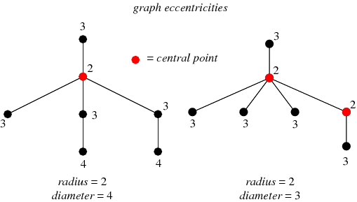
In the graph on the left, the red node has an eccentricity of 2. It can reach most other nodes in 1 hop, but it takes 2 hops to get to 2 nodes. The maximum distance it would take to get to all other nodes is therefore 2.
In SEO, we often look at click-depth distribution from the homepage, but this metric allows us to start thinking about non-homepage URLs as starting points. For example, we could look at the eccentricity of top-linked (external links) URLs to investigate click-depth from them as the starting node.
print(nx.eccentricity(G))Output:
{‘H’: 2,
‘Cat_A’: 3,
‘Cat_B’: 3,
‘Cat_C’: 3,
‘Cat_C_1’: 3,
‘Cat_C_2’: 3,
‘PDP_Cat_A_1’: 3,
‘PDP_Cat_A_2’: 3,
‘PDP_Cat_A_3’: 3,
‘PDP_Cat_B_1’: 3,
‘PDP_Cat_B_2’: 3,
‘PDP_Cat_B_3’: 3,
‘PDP_Cat_C_1’: 3,
‘PDP_Cat_C_2’: 3,
‘PDP_Cat_C_3’: 3,
‘PDP_Cat_C_1_1’: 3,
‘PDP_Cat_C_1_2’: 3,
‘PDP_Cat_C_2_1’: 3,
‘PDP_Cat_C_2_2’: 3}
This output shows the node_id and eccentricity value for each node in the graph. We know that a use could get from the Homepage (H) to all other pages (nodes) in 2 hops. If we entered on Cat_C, we could reach all other pages in 3 hops.
3) Diameter:
Diameter is the distance between the farthest separated nodes on the graph. In other words, how many hops would it take to get from one edge of the graph to the other? Technically, the diameter is the maximum eccentricity.
A site with a large diameter might have issues related to click-depth or connectivity. This can dilute link value across the graph and can suggest the existence of bottlenecks, bridges, or loosely connected subgraphs.
We can use the visual from a moment ago to look at diameter.
On the left graph, the two nodes with an eccentricity of 4 define the diameter of the graph. They have the maximum distance to travel to reach each other, which is 4 hops. Both of the 4 nodes are pushed away from the site by a bottleneck/bridge.
print(nx.diameter(G))Output: 3
This tells us the furthest travel distance between any two pages on the site is 3 hops.
Note that this function, and other functions that depend on it, can fail for graphs that aren’t well-connected. That can produce an infinite diameter. I’ll talk about this more as we progress in the series.
4) Periphery:
The periphery is the set of nodes with eccentricity equal to the diameter. In other words, which nodes are the furthest apart.
If we look at our example image above, these are the nodes with an eccentricity of 4.
print(nx.periphery(G))Output:
[‘Cat_A’,
‘Cat_B’,
‘Cat_C’,
‘Cat_C_1’,
‘Cat_C_2’,
‘PDP_Cat_A_1’,
‘PDP_Cat_A_2’,
‘PDP_Cat_A_3’,
‘PDP_Cat_B_1’,
‘PDP_Cat_B_2’,
‘PDP_Cat_B_3’,
‘PDP_Cat_C_1’,
‘PDP_Cat_C_2’,
‘PDP_Cat_C_3’,
‘PDP_Cat_C_1_1’,
‘PDP_Cat_C_1_2’,
‘PDP_Cat_C_2_1’,
‘PDP_Cat_C_2_2’]
This function filters the eccentricity output down to just the nodes with a value equal to the diameter. These pages have the longest travel distance to all other pages. We can explore the paths out from these pages to find bottlenecks and opportunities to pull in the graph’s diameter.
5) Center:
The center is the set of nodes with eccentricity equal to the radius (half the diameter). Another way to define it are the nodes with the minimum eccentricity.
While all three of our scenarios have the same single node as a center, a graph can have more than one center node. Let’s look at our example again.
The graph on the right has two different center nodes. The extra “3” node to the right shifts the center of the graph.
print(nx.center(G))Output: [‘H’]
Due to the interconnectivity of Home, it’s the center of this graph. It is linked site-wide and has a diverse set of links out to all sections of the site.
In SEO, centers of the site may be well-linked to hubs. Pages that have many inlinks (site-wide link, sub-nav links) and that have a broad range of outbound links are very easy to travel into and out of.
6) Transitivity:
Transitivity is the overall probability for the network to have adjacent nodes interconnected, thus revealing tightly connected communities (or clusters, subgroups, cliques). In simple terms, how likely are my friend’s friends my friends? These relationships create triangles, and this is called triadic closure.
Transitivity looks at the frequency of these across the entire graph and is a measure of large-scale clustering. Clustering is also suggestive of redundancy. If an edge disappears, an alternative path may still exist.
This score is the number of triangle relationships found divided by the total number of triangles the graph could have.
In SEO, this can suggest structural or topical clustering. Features like breadcrumbs or other types of category-like links from PDP or blog posts can create these triangle relationships, especially in partnership with related product/post features. They can also be introduced via site-wide or section-wide links (navigation systems).
print(nx.transitivity(G))Output: 0.45027624309392267
This is a moderate value, but Scenario 2 and 3 are much higher than Scenario 1. The link to the homepage from every page create a few triangle relations in S1, but as we introduce breadcrumbs in Scenario 2, the transitivity doubled.
7) Average Clustering:
The clustering coefficient is a measure of the degree to which nodes in a graph tend to cluster together. How much does the graph have tightly knit groups of high density? Clustering is the fraction of all pairs of a node’s neighbors that have an edge between them.
The clustering coefficient looks at node triplets. They can either be closed (triangle) or open (one side of triangle missing). It’s looking at the number of closed triplets relative the total number of opened and closed triplets.
print(nx.average_clustering(G))Output: 0.4660139567783397
Transverse the Graph
We might want to track a path along the graph between two different nodes. This is a relatively trivial task with a graph as small as our example graph, but as the number of nodes and edges grow, you may want a programmatic way to transverse. These transversal methods are also the basis of some algorithms.
Before we go through code examples, take a moment to skim these videos on Depth First Search and Breadth First Search. It’s helpful to have a general sense of the differences between the two approaches.
What is Depth First Search?
What is Breadth First Search?
How to Transverse the Graph
We can have NetworkX start at any node and travel alone the edges using either DFS or BFS. Think of this as a crawler or user navigating the site via the links and recording its path. The methodology you chose sets the rules for the transversal.
- Breadth First Search: Explore all outbound links on starting node, then move deeper.
- Depth First Search: Explore one outbound link on starting nodes and the target’s node’s outlinks, then come back and check another link in-depth.
Depth First Search
print(list(nx.dfs_edges(G, source="Cat_A", depth_limit=2)))In this code, we executed a DFS starting at node Cat_A and set a depth_limit of 2, which limited the travel to only 2 hops.
Output:
[(‘Cat_A’, ‘H’),
(‘H’, ‘Cat_B’),
(‘H’, ‘Cat_C’),
(‘H’, ‘PDP_Cat_A_1’),
(‘H’, ‘PDP_Cat_B_1’),
(‘H’, ‘PDP_Cat_C_1’),
(‘Cat_A’, ‘PDP_Cat_A_2’),
(‘PDP_Cat_A_2’, ‘PDP_Cat_B_2’),
(‘Cat_A’, ‘PDP_Cat_A_3’),
(‘PDP_Cat_A_3’, ‘PDP_Cat_B_3’)]
Breadth First Search
print(list(nx.bfs_edges(G, source="Cat_A", depth_limit=2)))Output:
[(‘Cat_A’, ‘H’),
(‘Cat_A’, ‘PDP_Cat_A_1’),
(‘Cat_A’, ‘PDP_Cat_A_2’),
(‘Cat_A’, ‘PDP_Cat_A_3’),
(‘H’, ‘Cat_B’),
(‘H’, ‘Cat_C’),
(‘H’, ‘PDP_Cat_B_1’),
(‘H’, ‘PDP_Cat_C_1’),
(‘PDP_Cat_A_2’, ‘PDP_Cat_B_2’),
(‘PDP_Cat_A_3’, ‘PDP_Cat_B_3’)]
This is the same concept as the DFS, but it used a different method. In this approach, it explored all the links on Cat_A first before it went deeper.
Predecessors & Successors
We can also output the nodes of the search along with the Predecessors (Source) and their Successors (Targets).
Predecessors
Here is the code for both the DFS approach.
print(nx.dfs_predecessors(G, source="Cat_A", depth_limit=2))Output:
{‘H’: ‘Cat_A’,
‘Cat_B’: ‘H’,
‘Cat_C’: ‘H’,
‘PDP_Cat_A_1’: ‘H’,
‘PDP_Cat_B_1’: ‘H’,
‘PDP_Cat_C_1’: ‘H’,
‘PDP_Cat_A_2’: ‘Cat_A’,
‘PDP_Cat_B_2’: ‘PDP_Cat_A_2’,
‘PDP_Cat_A_3’: ‘Cat_A’,
‘PDP_Cat_B_3’: ‘PDP_Cat_A_3’}
This output says:
– H was found on Cat_A
– Cat_B was found on H
– Cat_C was found on H
Successors
Here is the code for both the DFS approach.
print(nx.dfs_successors(G, source="Cat_A", depth_limit=2))Output:
{‘Cat_A’: [‘H’, ‘PDP_Cat_A_2’, ‘PDP_Cat_A_3’],
‘H’: [‘Cat_B’, ‘Cat_C’, ‘PDP_Cat_A_1’, ‘PDP_Cat_B_1’, ‘PDP_Cat_C_1’],
‘PDP_Cat_A_2’: [‘PDP_Cat_B_2’],
‘PDP_Cat_A_3’: [‘PDP_Cat_B_3’]}
The output says:
– Cat_A was the source for finding H, PDP_Cat_A_2, PDP_Cat_A_3
– H was the source for finding Cat_B, Cat_C, PDP_Cat_A_1, PDP_Cat_B_1, PDP_Cat_C_1
Note that it doesn’t show “PDP_Cat_A_1” as being discovered on Cat_A, even though there is a link to it. That’s due to the depth-first approach. It went to H and then explored those links first. That product page is linked from the Homepage, so by the time it explored the links on Cat_A, the algorithm already discovered one of the products linked there.
Finding Neighbors
Related to transversing, we can also explicitly ask for the neighbors of a particular node. This won’t use a DFS or BFS approach but will give you all of the neighbors connected to a node.
There are three approaches we can use:
Neighbors
For an undirected graph, this will return all nodes connected to a node. For a directed graph, it will return successors.
print(list(G.neighbors("Cat_B")))Output: [‘H’, ‘PDP_Cat_B_1’, ‘PDP_Cat_B_2’, ‘PDP_Cat_B_3’, ‘Cat_A’]
Successors or Targets (explicit)
This code gives us a node’s Successors or its Targets. These are the pages it links to. This will provide the same result as neighbors for a directed graph, but we’re explicitly asking for them with this method.
print(list(G.successors("Cat_B")))Output: [‘H’, ‘PDP_Cat_B_1’, ‘PDP_Cat_B_2’, ‘PDP_Cat_B_3’, ‘Cat_A’]
Predecessors or Sources
This will gives us all of the Predecessors or Sources. These are the pages that link to the node.
print(list(G.predecessors("Cat_A")))Output:
[‘H’,
‘PDP_Cat_A_1’,
‘PDP_Cat_A_2’,
‘PDP_Cat_A_3’,
‘Cat_A’,
‘Cat_B’,
‘Cat_C_1’,
‘Cat_C_2’]
Paths & Shortest Paths
We can also use NetworkX to plot out the paths between a set of nodes. While multiple paths between a pair of nodes might exist, the “Shortest Paths” are those with the least hops required.
Check If There Is a Path
First, we can confirm that there is a path between two nodes. This will return either True or False.
print(nx.has_path(G, "Cat_A", "PDP_Cat_C_2"))Output: True
We know that a path does exist between Cat_A and the product page PDP_Cat_C_2. Next, let’s figure out what that path is.
Shortest Path
This will return a list of nodes that outline the path between the two nodes.
print(nx.shortest_path(G, "Cat_A", "PDP_Cat_C_2"))Output: [‘Cat_A’, ‘H’, ‘Cat_C’, ‘PDP_Cat_C_2’]
This means the shortest path is:
Cat_A => H => Cat_C => PDP_Cat_C_2
Length of Shortest Path
If we just want to know the length of the path, we can use:
print(nx.shortest_path_length(G, "Cat_A", "PDP_Cat_C_2"))Output: 3
This lets us know three hops are required to get from Cat_A to PDP_Cat_C_2.
All Short Paths
There might be more than one short path between two nodes. To get them all:
print(list(nx.all_shortest_paths(G, "Cat_C_1", "Cat_B")))Output:
[[‘Cat_C_1’, ‘H’, ‘Cat_B’],
[‘Cat_C_1’, ‘PDP_Cat_C_1_1’, ‘Cat_B’],
[‘Cat_C_1’, ‘PDP_Cat_C_1_2’, ‘Cat_B’]]
This gives us three seperate short paths between Cat_C_1 and Cat_B:
- Cat_C_1 => H => Cat_B
- Cat_C_1 => PDP_Cat_C_1_1 => Cat_B
- Cat_C_1 => PDP_Cat_C_1_2 => Cat_B
All Paths
Perhaps we want to know all of the paths, even if they’re not the shortest.
print(list(nx.all_simple_paths(G, source="Cat_A", target="Cat_B", cutoff=2)))Output:
[[‘Cat_A’, ‘H’, ‘Cat_B’],
[‘Cat_A’, ‘PDP_Cat_A_1’, ‘Cat_B’],
[‘Cat_A’, ‘PDP_Cat_A_2’, ‘Cat_B’],
[‘Cat_A’, ‘PDP_Cat_A_3’, ‘Cat_B’]]
Here I’m using the “cutoff=2” parameter to limit the length of the paths I’m looking at. None of the paths returned require more than two hops. If I removed that, I’d get many more path combinations.
Understanding Centrality
Centrality metrics look at the structural connectivity of a node with the rest of the graph. We can score a node based on its internal discoverability, popularity, or influence. For example, PageRank is a type of centrality measurement.
NetworkX gives us several different ways to measure centrality. Each provides a slightly different perspective on a node’s relationship with the rest of the graph. I’ll go through them, show the code, and then briefly discuss how we can use it for SEO.
1) In-degree Centrality
Degree is a simple centrality measure that counts how many neighbors a node has. For a directed graph, such as an SEO inlink graph, we can look at in-degree, the number of inbound nodes linking, and the out-degree, the number of nodes linked out to.
A node is considered important if it has many neighbors. For SEO, we tend to be more interested in in-degree. You can think of this as the count of unique URLs linking to a URL.
NetworkX returns this as the proportion of all nodes that link to the node.
For these, I sorted and limited the output to the top 10.
in_degree = nx.in_degree_centrality(G)
#print and sort by value
print(sorted(in_degree.items(), key=lambda x: x[1], reverse=True)[0:10])
Output:
[(‘H’, 1.0), (‘Cat_B’, 0.7777777777777777), (‘Cat_C’, 0.5555555555555556), (‘Cat_A’, 0.4444444444444444), (‘PDP_Cat_B_1’, 0.3333333333333333),
[(‘H’, 1.0),
(‘Cat_B’, 0.7777777777777777),
(‘Cat_C’, 0.5555555555555556),
(‘Cat_A’, 0.4444444444444444),
(‘PDP_Cat_B_1’, 0.3333333333333333),
(‘PDP_Cat_B_2’, 0.2777777777777778),
(‘Cat_C_1’, 0.16666666666666666),
(‘Cat_C_2’, 0.16666666666666666),
(‘PDP_Cat_A_1’, 0.16666666666666666),
(‘PDP_Cat_B_3’, 0.16666666666666666)]
We can read this as 100% of pages link to Home (H) and 77.78% of pages link to Category B.
2) Out-degree Centrality
out_degree = nx.out_degree_centrality(G)
print(sorted(out_degree.items(), key=lambda x: x[1], reverse=True)[0:10])
Output:
[(‘Cat_C’, 0.5555555555555556),
(‘H’, 0.3333333333333333),
(‘Cat_A’, 0.2777777777777778),
(‘Cat_B’, 0.2777777777777778),
(‘Cat_C_1’, 0.2777777777777778),
(‘Cat_C_2’, 0.2777777777777778),
(‘PDP_Cat_C_1_1’, 0.2777777777777778),
(‘PDP_Cat_C_1_2’, 0.2777777777777778),
(‘PDP_Cat_C_2_1’, 0.2777777777777778),
(‘PDP_Cat_C_2_2’, 0.2777777777777778)]
We can read this as Cat_C links to 56% of all pages, Home (H) links to 33.33%, and Category A links to 28%.
This function is similar to using Excel to build a pivot table to count the number of inlinks or outlinks of a source. It’s helpful to find what has the most significant raw popularity in terms of links as votes.
3) Betweenness Centrality
Earlier, we calculated the shortest path between any pair of nodes in the graph. Betweenness Centrality counts how many times a shortest path passed through a node. A node with a high Betweenness Centrality acts as a “bridge” for many network nodes.
For SEO, this means the links on these pages play an essential role in connecting different link graph sections. Removal of these nodes or links might make a network less connected and more brittle.
Nodes with high betweenness values influence a network due to their control of value flow through a network.
betweenness = nx.betweenness_centrality(G, normalized=False)
print(sorted(betweenness.items(), key=lambda x: x[1], reverse=True)[0:10])
Output:
[(‘Cat_C’, 121.89999999999999),
(‘H’, 97.35833333333333),
(‘Cat_B’, 39.199999999999996),
(‘Cat_A’, 36.56666666666667),
(‘PDP_Cat_C_1_1’, 7.408333333333333),
(‘PDP_Cat_B_3’, 5.833333333333333),
(‘PDP_Cat_C_1’, 4.708333333333333),
(‘Cat_C_1’, 4.333333333333333),
(‘Cat_C_2’, 4.0),
(‘PDP_Cat_B_2’, 2.1666666666666665)]
Unsurprisingly, the Category and Homepages have high betweenness scores. They act as the backbone of the site. What’s also interesting, though, is the sharp fall-off in scores as we move down the list. Product pages are more on the edges of the structure and do not help connect many pages.
Cat_C is inflated, in part, due to the robustness of its assortment. It has the most subcategories and the most product pages. It’s a vital pathway to that segment of URLs.
PDPs in Scenario 3 will have a higher score than Scenario 1. Features like Related Products help PDPs act as a bridge between other PDPs.
4) Eigenvector Centrality
Eigenvector Centrality is related to Degree Centrality, except that not all nodes are treated equally. A node may be more or less important based on its connections. Eigenvector centrality determines that a node is important if it is linked to by other important nodes. If this sounds familiar, that’s because PageRank is a variant of eigenvector centrality.
Eigenvector centrality and degree centrality have important differences. A node with many links may not have a high eigenvector centrality if its links come from nodes with low eigenvector centrality. Conversely, a node with a high eigenvector centrality may not necessarily have many inlinks, but instead my have links from a few highly important nodes.
You could think of this as a weighted inlink count. It’s a step towards the concept of PageRank, but lacks a few of the modifications PageRank introduces.
eigenvector = nx.eigenvector_centrality(G)
print(sorted(eigenvector.items(), key=lambda x: x[1], reverse=True)[0:10])
Output:
[(‘H’, 0.5615042519589158),
(‘Cat_B’, 0.42519947445302214),
(‘Cat_A’, 0.3776754360233439),
(‘PDP_Cat_B_1’, 0.317208266189568),
(‘Cat_C’, 0.27390650954767315),
(‘PDP_Cat_C_1’, 0.22922689512557237),
(‘PDP_Cat_A_1’, 0.21436779139952253),
(‘PDP_Cat_B_2’, 0.13872703104723316),
(‘PDP_Cat_B_3’, 0.11033195366747021),
(‘PDP_Cat_C_1_1’, 0.0938014444559294)]
As SEOs, we could use this as an alternative to inlink counts. It will value inlinks from important pages more than links from other unimportant pages.
5) Closeness Centrality
Closeness Centrality looks at the mean distance from a node to other nodes. In other words, it’s looking at how many hops a page is from other pages. A lower mean distance means link value can travel more quickly to other nodes.
This is often calculated as an inverse value, so a higher value indicates a higher centrality.
closeness = nx.closeness_centrality(G)
print(sorted(closeness.items(), key=lambda x: x[1], reverse=True)[0:10])
Output:
[(‘H’, 1.0),
(‘Cat_B’, 0.8181818181818182),
(‘Cat_C’, 0.6923076923076923),
(‘Cat_A’, 0.6206896551724138),
(‘PDP_Cat_B_1’, 0.6),
(‘PDP_Cat_B_2’, 0.5806451612903226),
(‘PDP_Cat_A_1’, 0.5454545454545454),
(‘PDP_Cat_C_1’, 0.5454545454545454),
(‘PDP_Cat_B_3’, 0.5142857142857142),
(‘PDP_Cat_C_1_1’, 0.47368421052631576)]
This can be important in SEO due to the potential decay in link value over a distance (hops). A low mean distance means a page may be effective at distributing equity quickly and broadly (a helpful thing for issues like crawl and indexation control). These could be effective targets for external link acquisition, or effectivity targets to boost internal PageRank.
6) PageRank
PageRank is a variant of eigenvector centrality with a couple of important modifications.
PageRank vs. Eigenvector Centrality
Two of the big modifications to eigenvector centrality are:
- Starting Value: PageRank assumes that every node starts with a minimum positive amount of centrality that it can transfer to other nodes. The eigenvector centrality approach would assign a null value to anything without inlinks (i.e., orphan pages, such as URL only discoverable in your sitemaps). This means even unlinked nodes can have a baseline level of centrality. A node’s existence gives it a baseline centrality.
- Link Value Split by Outbound Links: One of the limitations of eigenvector centrality is that it doesn’t account for the number of outlinks a node has. If a node with a high centrality links to many others, they all end up with high centrality scores. A high valued page passes high value votes no matter how many votes it casts (outlinks). PageRank adjusts this by diluting the value passed per link based on the number of outbound links on a source. If we have two nodes with the same centrality value, the one with fewer outbound links will pass along more value.
PageRank in Simple Terms
PageRank is determined by:
- The number of links a page receives
- The centrality score of the linkers (its sources)
- The number of outbound links on those linkers (sources), which splits value passed.
The Role of PageRank in SEO
PageRank is still important because it’s the conceptual basis of how link scoring works at Google, even if it looks quite different from what Google uses today. A measure conceptually similar to this is also an influencer of crawl discovery, crawl frequency, crawl budget, and indexation.
It is an imperfect measure but can provide a helpful quantitative metric to evaluate the pages’ discoverability on our site.
In my experience, a low “Internal PageRank” can act as a gatekeeper. Pages with lower PageRank are less likely to appear consistently in search or get crawled frequently. It doesn’t correlate perfectly with performance, but if you look at it as PageRank tiers, you can see that a smaller proportion of URLs at low PageRank tiers get impressions and clicks in search.
Ways PageRank Can Be Modified
Much of Google’s improvements in link analysis came from more nuanced classifications of nodes and edges, assigning variable attributes and adjustments to node and edge weights.
Two easy examples are spam classifiers and link position. Spam classifiers could calculate a spam risk score, which can reduce the edge weight (so the edge has little to no influence on scoring). Link position could also be used to reduce edge weights. Links far down the page (i.e., footer) could be classified as such and have their edge weights reduced.
Many other complexities have been introduced over the years, including node/site classifiers, topical analysis, anchor text, other link scoring algorithms, NLP, and machine learning.
In future parts of this series, I’d like to explore methods to personalize our PageRank score. We could use external link data to personalize the starting value of nodes, and we could use features like Link Positions in Screaming Frog to adjust edge weight. These two features could give us a more accurate view of link value distribution on a website.
For now, here is the code for a basic PageRank calculation:
pr = nx.pagerank(G, alpha=0.85)
print(sorted(pr.items(), key=lambda x: x[1], reverse=True)[0:10])
Output:
[(‘H’, 0.17149216459884561),
(‘Cat_B’, 0.14056484426285368),
(‘Cat_A’, 0.1056413450461342),
(‘PDP_Cat_B_1’, 0.09112427998912859),
(‘Cat_C’, 0.07295371642969682),
(‘PDP_Cat_C_1’, 0.0642084494844585),
(‘PDP_Cat_A_1’, 0.06326390910410426),
(‘PDP_Cat_B_2’, 0.04629085488918581),
(‘PDP_Cat_B_3’, 0.040279672813604506),
(‘PDP_Cat_C_1_1’, 0.02926645762687125)]
7) HITS – Authorities and Hubs
The HITS algorithm is an alternative way of trying to identify popular and relevant pages in a link graph. It provides two separate scores, an Authority measure, and a Hubs measure. Authorities are valued based on the links it receives. Hubs are valued based on the popularity of what it links to.
All nodes start with a baseline score. Authorities collect votes from nodes that link to them and receive an authority score for those votes. Hubs are determined backward. Hubs collect authority scores based on the authority of the nodes they link to.
A page with a high hub score links to many good authorities. A page with a high authority score is linked from many good hubs.
h, a = nx.hits(G)
print(sorted(h.items(), key=lambda x: x[1], reverse=True)[0:10])
print(sorted(a.items(), key=lambda x: x[1], reverse=True)[0:10])
Hubs Output:
[(‘PDP_Cat_C_1_1’, 0.06436223087040421),
(‘PDP_Cat_C_2_1’, 0.06436223087040421),
(‘PDP_Cat_C_1_2’, 0.06300240566029872),
(‘PDP_Cat_C_2_2’, 0.06300240566029872),
(‘PDP_Cat_C_1’, 0.060453461362507954),
(‘PDP_Cat_C_2’, 0.05909363615240246),
(‘PDP_Cat_A_1’, 0.05627478146946787),
(‘PDP_Cat_C_3’, 0.05608254837696922),
(‘PDP_Cat_A_2’, 0.05491495625936237),
(‘H’, 0.054184874399340825)]
Authorities Output:
[(‘H’, 0.20203056887825724),
(‘Cat_B’, 0.1654695883866158),
(‘Cat_C’, 0.12428047656227416),
(‘Cat_A’, 0.08514332345961308),
(‘PDP_Cat_B_1’, 0.0744212369768357),
(‘PDP_Cat_B_2’, 0.06168523211333832),
(‘Cat_C_1’, 0.03660919586789751),
(‘Cat_C_2’, 0.03660919586789751),
(‘PDP_Cat_B_3’, 0.033483645418707284),
(‘PDP_Cat_C_1’, 0.030044294341803064)]
The authority scores aren’t surprising. The order of pages generally aligns with other types of centrality measures. We see the impact of features like breadcrumbs, though. Breadcrumbs make all child categories and products link to their parent category, which gives categories higher authority scores.
Breadcrumbs and Related Product links work together to give products high Hub scores. Subcats and PDPs get few inlinks, as they’re typically only linked to from their parents and from related products on other PDPs. They tend to get low authority scores and higher hub scores due to their breadcrumb links back up to categories (which tend to have high authority scores).
The PDPs that appear highest by authority score received the most inlinks from the Related Products feature.
Understanding Connectivity
Connectivity is a measure of a graph’s resilience. In other words, how resistant is the graph to be broken into parts by the removal of a node or edge. We talked about this a bit earlier with density and redundancy. There are some tools we can use to explore the weak points in a graph’s structure.
Minimum Cut
The basis of connectivity is the concept of minimum cut. Minimum cut is the number of nodes or edges that need to be removed to split the graph into two unconnected parts.
Here is how we can find the minimum node cut between two nodes (note that we needed to import a new package to use this function.)
import networkx.algorithms.connectivity as nxcon
print(nxcon.minimum_st_node_cut(G, "Cat_A", "PDP_Cat_C_2_2"))
Output: {‘Cat_C’}
This tells us without the Category C page there would be no page between our node pair.
We can also test check which edge (link) is the minimum edge cut.
print(nxcon.minimum_st_edge_cut(G, "Cat_A", "PDP_Cat_C_2_2"))Output:
{(‘Cat_C_2’, ‘PDP_Cat_C_2_2’), (‘Cat_C’, ‘PDP_Cat_C_2_2’)}
This tells us that the links on Category C and one of the Category C Subcats (Cat_C_2) are the minimum number of links we’d have to remove for the product page to be disconnected from Cat_A.
Average Connectivity
We can look at the minimum cut concept across the graph as a whole. Connectivity measures for a node are the smallest minimum cut between a node and all other nodes on the graph. We can calculate that for all nodes in the graph and average them.
print(nx.average_node_connectivity(G))Output: 2.526315789473684
Average connectivity is a useful measure to compare resilience and redundancy in the graph. As more alternative paths are introduced in a graph, the higher the measure will be.
Comparing Link Graphs
Now we’re going to start putting everything together and compare different link graphs. I will compare the three different link graph scenarios I outlined at the start of the post. We’ll be able to see how incremental inlinks added by various site features influence the link graph.
One use case for this is to model how different site features will change your internal link graph’s characteristics. Let’s say we exported the inlink report from Screaming Frog for a crawl of our site. We could then append it with the incremental inlink pairs that would come from new features. For example, what impact would a sub-navigation menu on Category pages or a Related Search feature have on your link graph? We can compare the current graph with the proposed graph. We can model different link choices and decisions we need to make. We could also model the impact of the addition or removal of URLs on the site.
Importing Multiple Graphs
I’ll import a CSV for each scenario and store them as separate graphs (G1, G2, G3). This is the same process we went through at the start of the post, but if you’d like the code, here it is (not the most efficient method, I’m just repeating the same code three times for each CSV):
data_dir = Path('.') / 'data'

#Import Scenario 1 Inlinks
# Open CSV
with open(data_dir / 'scenarios' / 's1.csv', 'rb') as f:
    # Skip header
    next(f)

    # Read edgelist format
    G1 = nx.read_edgelist(
        f,
        delimiter=",",
        # Create using directed graph
        create_using=nx.DiGraph,
        # Use Source and Target columns to define the nodes of our edges
        data=[('Source', str), ('Target', str)])

#Import Scenario 2 Inlinks
with open(data_dir / 'scenarios' / 's2.csv', 'rb') as f:
    # Skip header
    next(f)

    # Read edgelist format
    G2 = nx.read_edgelist(
        f,
        delimiter=",",
        # Create using directed graph
        create_using=nx.DiGraph,
        # Use Source and Target columns to define the nodes of our edges
        data=[('Source', str), ('Target', str)])

#Import Scenario 2 Inlinks
with open(data_dir / 'scenarios' / 's3.csv', 'rb') as f:
    # Skip header
    next(f)

    # Read edgelist format
    G3 = nx.read_edgelist(
        f,
        delimiter=",",
        # Create using directed graph
        create_using=nx.DiGraph,
        # Use Source and Target columns to define the nodes of our edges
        data=[('Source', str), ('Target', str)])
Plot Graphs Side-by-side
We can now plot each of the graphs (G1, G2, G3) side-by-side for a quick comparison. I won’t do any fancy styling. This is to compare their shapes.
#Create figure and set its size
plt.figure(figsize=(8, 3))

#Create 1 of 3 subplots
plt.subplot(1, 3, 1)
plt.title("Scenario 1")

#Draw graph for G1 (Scenario 1)
nx.draw_networkx(G1, node_size=20, node_color="#EF476F",
                 edge_color="#06D6A0", with_labels=False)

#Create 2nd subplot
plt.subplot(1, 3, 2)
plt.title("Scenario 2")

#Draw graph for G2 (Scenario 2)
nx.draw_networkx(G2, node_size=20, node_color="#EF476F",
                 edge_color="#06D6A0", with_labels=False)

#Create 3rd subplot
plt.subplot(1, 3, 3)
plt.title("Scenario 3")

#Draw graph for G3 (Scenario 3)
nx.draw_networkx(G3, node_size=20, node_color="#EF476F",
                 edge_color="#06D6A0", with_labels=False)

plt.tight_layout()
plt.show()
Here is what we get:
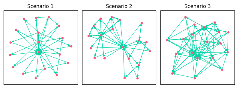
As we added features, we increased the edges, clustering, and density of the link graph. The addition of breadcrumbs created more topical clustering in Scenario 2. You can see how Scenario 2 kind of looks like a bowtie. It has 3 distinct clusters of pages based on category.
As a quick refresher:
- Scenario 1: A basic directory-like approach with all pages linking to their children and the homepage.
- Scenario 2: Added links from breadcrumbs on categories and PDPs.
- Scenario 3: Added related products on PDP, a popular category features on both PDPs and categories, and the homepage added links to top products.
Let’s dig a bit deeper and see what NetworkX can tell us about the quantitative differences between these three graphs.
Comparing In Degree Distribution
While we can see that the density of the graph increased from the visuals above, perhaps we want to see how the distribution of inlinks to pages changed. In degree will give us the number of inbound edges (inlinks) and we can plot those as a histograph.
#Function to return list of in degree counts
def in_degree_list(x):
    #Find in_degree_centrality scores, which gives us in degree as percent of all nodes
    in_degree = nx.in_degree_centrality(x)
    #Find how many nodes are in the graph
    num_nodes = nx.number_of_nodes(x)
    #Extract the in_degree_centraility scores. Will create list of values without associated node_id.
    in_degree_list = in_degree.values()
    #Loop through values in in_degree_list and multiply them by number of nodes. Then round for integer.
    in_degree_count = [round(i * num_nodes) for i in in_degree_list]
    #Return list of in degree counts
    return in_degree_count


def in_degree_histogram(x, title="Path Length Comparison"):
    plt.hist(x, facecolor='#00aff4')
    plt.title(title)
    plt.xlabel("In Degree")
    plt.ylabel("Count")


# Create a figure
plt.figure(figsize=(8, 3))
# Calculate centralities for each example and plot
plt.subplot(1, 3, 1)
in_degree_histogram(
    in_degree_list(G1), title="Scenario 1")
plt.subplot(1, 3, 2)
in_degree_histogram(
    in_degree_list(G2), title="Scenario 2")
plt.subplot(1, 3, 3)
in_degree_histogram(
    in_degree_list(G3), title="Scenario 3")
# Adjust the layout
plt.tight_layout()
plt.show()
First I created a function that will return a list of the in degree values for all nodes in the graph. There is a function for this, but I ran into issues with methods no longer supported in NetworkX. Instead of trying to solve it, I just calculated it myself. In_degree_centrality gives us the data we want as a percentage of all nodes, so I just multiplied that by the number of nodes in the graph.
Once we plot this, we get:
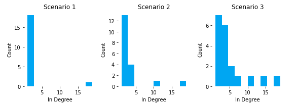
We can see that all pages in S1, except home, had 1 or 2 inlinks. As we added breadcrumbs in S2, our category pages moved up to 3 or 4 inlinks, except Cat_C. One of the downsides of breadcrumbs as inlink drivers is that inlink distribution is heavily dependent on assortment and the child lineage of the breadcrumb. Cat_C reaches 11 inlinks because it has the most products and subcategoriges.
In S3, we can see how cross-linking features can flatten out the distribution and gives you more pages with high inlink counts. In this scenario, Cat_B actually overtook Cat_C as the category page with the most inlinks (and highest PageRank). This can be important because we can better align internal popularity (PageRank) with external demand (search volume a page targets), instead of leaving to internal popularity to chance based on product assortment counts and category-level granularity.
Comparing Path Lengths
We can evaluate how different measures, such as short path lengths, changes between the different scenarios.
def path_length_histogram(G, title=None):

    # Find path lengths
    length_source_target = dict(nx.shortest_path_length(G))

    # Convert to list
    all_shortest = sum(
        [list(length_target.values())
         for length_target in length_source_target.values()],
        [])

    # Calculate integer bins
    high = max(all_shortest)
    bins = [-0.5 + i for i in range(high + 2)]

    # Plot histogram
    plt.hist(all_shortest, bins=bins, rwidth=0.8, facecolor='#00aff4')
    plt.title(title)
    plt.xlabel("Distance")
    plt.ylabel("Count")


plt.figure(figsize=(8, 3))
plt.subplot(1, 3, 1)
path_length_histogram(G1, title="Scenario 1")
plt.subplot(1, 3, 2)
path_length_histogram(G2, title="Scenario 2")
plt.subplot(1, 3, 3)
path_length_histogram(G3, title="Scenario 3")
plt.tight_layout()
plt.show()
Let’s walk through what is done here.
The path_length_histogram function will output histogram data for the distribution of shortest path lengths in a graph. First, we calculate the shortest path lengths and store them in a dictionary. That dictionary shows the shortest path lengths between a node and every other node in the graph. Those values of those lengths are extracted and put into a list. The variable “all_shortest” is just a list of values like “0, 1, 1, 1, 2, 2…”. From there, we create bins (ranges for each column), and then I count the values in the list in each of the bin ranges. We then plot a histogram for each of the scenarios.
Here is the output we get:
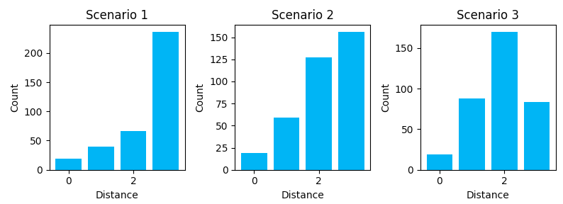
Scenario 1 shows us some of the downsides of a directory-like link structure (H -> Cat -> Product). It’s nearly a tree-like structure, except for the homepage link on every page. It’s a very structured link graph, but it introduces a lot of depth and distance between nodes. To travel from a product in Cat_A to a product in Cat_B, you must transverse back to home and then down though the category lineage again. There is no “horizontal” path across the structure. We see this with the many longer distances.
Scenario 2 shows us how breadcrumbs shorten the travel distance between some node types. The graph starts to shift towards shorter paths. With a breadcrumb, you can travel right back to the category without having to pass through home.
Scenario 3 shows how additional link features can further shift the distribution to the left, putting all nodes closer together. These cross-linking features can help share link value across different category linegages.
Comparing PageRank Distribution
We can use the same approach to compare how PageRank scores’ distribution has changed across the different link scenarios.
# Function to plot a histogram
def pagerank_histogram(x, title=None):
    plt.hist(x, facecolor='#00aff4')
    plt.title(title)
    plt.xlabel("PageRank")
    plt.ylabel("Count")


# Create a figure
plt.figure(figsize=(8, 3))
# Calculate centralities for each example and plot
plt.subplot(1, 3, 1)
pagerank_histogram(
    nx.pagerank(G1).values(), title="Scenario 1")
plt.subplot(1, 3, 2)
pagerank_histogram(
    nx.pagerank(G2).values(), title="Scenario 2")
plt.subplot(1, 3, 3)
pagerank_histogram(
    nx.pagerank(G3).values(), title="Scenario 3")
# Adjust the layout
plt.tight_layout()
plt.show()
Our output is:
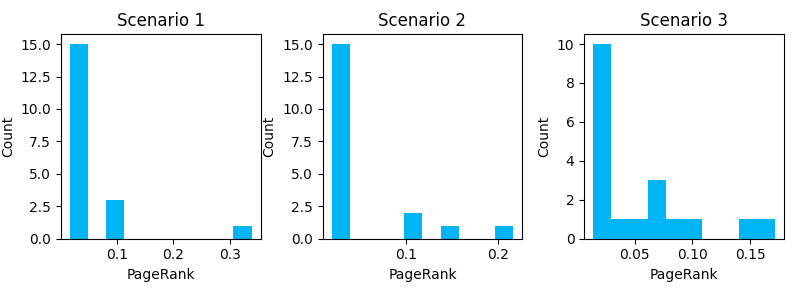
Here we can see how the introduction of link features shifts the distribution of internal PageRank. Additional cross-linking reduces the number of URLs with very low page rank, but it comes at the cost of no URL reaching a PageRank as high as a less dense graph (note the max value on the X-axis gets smaller as we progress through scenarios). Notice that the more URLs you have with higher PageRank scores, the lower the score of the URLs with the maximum PageRank will be.
Comparing Descriptive Measures
We can also rerun the previous discussed descriptive measurements to see how different link graphs compare.
| S1 | S2 | S3 | |
| Average Shortest Path Length | 2.57 | 2.28 | 1.19 |
| Diameter | 3 | 3 | 3 |
| Transitivity | 0.17 | 0.41 | 0.45 |
| Average Clustering | 0.72 | 0.77 | 0.47 |
| Average Node Connectivity | 1.08 | 1.24 | 2.53 |
| Density | 0.12 | 0.17 | 0.26 |
A few things we can observe here:
- Adding breadcrumbs had only a minimal impact on path length between nodes, but significantly increases transitivity. It creates more triangle relationships and clusters (pages of a Category lineage get clustered together).
- Adding features like Related Products and Top Product cross-linking reduces path length, increases connectivity, and increases density. It creates more redundancy and smooths out the distribution of popularity. These features introduce more “horizontal” travel between category lineages.
- Increased cross-linked reduced average clustering. With more cross-linking between “silos” (category lineages), there are fewer clusters and cliques. If we look at the graph of Scenario 2, we can see the bowtie-like shape and 3 distinct clusters. As we interconnect those clusters, the graph takes on more of a hairball shape.
- While increased density and shorter paths may improve indexation and link equity distribution, pages may be less likely to be clustered together in topical silos. There are pros/cons there when optimizing for SEO. There is relevancy value in topical clustering, but crawl, indexation, and link value distribution may benefit from cross-linking between topical lineages.
What’s Next
Depending on interest in the topic, I’d like to put together a couple more posts that cover more sophisticated analysis, use large real-world data sets (which introduce some complications), walk through some use cases, and share some user-friendly tool scripts that others can use in their auditing.
The next post in the series will look at managing much larger data sets. In this post we used a very small edgelist, which made it easier to demonstrate the concepts. However, the inlink exports for medium to large sites can easily reach 1GB to 20 GB in size (if not more), which is too large for Excel. We’ll take a real-world crawl, prepare it with Pandas using a Jupyter Notebook, and explore it with NetworkX.
If there are any particular topics you’re interested in, let me know over on Twitter at @JustinRBriggs
A 20gb dataset unlikely will be manageable with Panda too.
You definitely have to consider something like Dark or resorting to more complex map reduce operations.
For the rest, great to read something good from time to time.
I had no time to port my old Excel / graphviz based approach … So Great reminder here 😉
Bookmarked. Try. Shared. Come back again. Linked to. Reshared.